Diagramming DNA
Circos was invented to visualize similarities between genomes, but designers soon used it with more generalized data sets.
Benjamin Bollmann
March 2, 2012
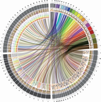
Its stunning images have recently graced the covers of several scientific journals: Circos, a data visualization tool, displays genetic data in a circular layout, so as to compare genomes and identify the similarities among species.

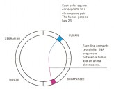
Similarities of the genomes of four species: humans, chimpanzee, mouse and zebrafish. Each line connects two similar DNA sequences between a human an animal chromosome.
© Martin Krzywinski, 2012
Circos is based on a simple a useful source: the genomes are spread along the circumference of a circle, and identical DNA sequences are connected with lines. The image’s effectiveness comes from its circular shape. If the genomes were placed side by side in a straight line, the lines would cross so often that the whole would quickly become unreadable.
Invented by Martin Krzywinski, a scientist at the Michael Smith Genome Sciences Centerin Vancouver, Circos quickly caught the attention of the media and infographic enthusiasts, who applied the technique to more generalized data sets. The New York Times published an interactive version on its website that allowed users to explore how presidential candidates quoted each other during speeches, and Wired magazine produced an infographic that showed the relationships among various characters in the TV series Lost.

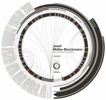
Circos was used to visualize general information about graphic designer Josef Müller-Brockmann.
© Quentin Delobel, 2011


