“We take several months to create an infographic”
National Geographic has already planned all its infographics until mid-2013. Art director Juan Velasco reveals how the magazine functions.
Benjamin Bollmann
September 12, 2012
National Geographic creates the infographics no other magazines could ever afford. Its design team takes months to research information and determine how to present it effectively.
Juan Velasco, the Spanish art director of the National Geographic magazine, is a celebrity in the infographics community. He has won numerous awards, including ten Malofiej awards and over 50 Society for News Design awards. As part of a team of writers and visual journalists for The New York Times where he worked as director of graphics from 1999 to 2002, he was, in 2001, a Pulitzer Prize finalist.
In 2002, Juan co-founded the agency 5W Infographics, which he continues to run with his three brothers – all designers.
What’s the design process for creating infographics at National Geographic?
Once we have decided what the story will be about, we spend a lot of time researching and gathering background information on the topic. We filter through what is new, relevant and what readers have never seen before, in order to create an original infographic. We then look for the experts in this field and ask them how they would visualize the story and inform people about it. It’s a process of finding out how to best to tell the story.
So you call experts, just like a journalist who writes articles?
Like a journalist who identifies what data is relevant, what is new and then what is true.
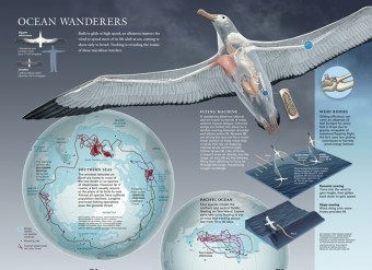
You created an infographic called “Ocean Wanderers” about albatrosses. How long did it take to make it? How many people did you work with?
I did the research, text and maps and I hired an artist to create the illustrations of the albatross. At publications like National Geographic and The New York Times the graphics teams do all the research and writing themselves. It’s very different from other newspapers. Whenever a story pops up, the graphics team comes up with an idea on how to cover it using infographics. It’s a very proactive process.
How long did it take to create the Ocean Wanderers infographic?
It took several months.
Do all the infographics at National Geographic take as much time?
Yes but we’re not just working on one graphic at a time. As National Geographic doesn’t depend on breaking news, we already know all the infographics that will be published up until mid-2013. So we are able to spend a lot of time researching and making sketches.
How many people work specifically for infographics at National Geographic?
Around 17 people, including cartographers. It’s a very strong department.
How much does a publication pay a freelance infographics designer in the US?
Prices mostly depend on the size. A top publication pays between two and three thousand dollars for a spread, sometimes more.
How many people work for your company 5W?
Just my brothers and me. We do most of the work ourselves; if we need something done differently or if there is something we don’t know how to do, we hire freelancers.
Do the freelancers come into the office or do you work with them by phone?
By phone. We work with people all over the place: Argentina, Costa Rica, Spain.
Do you design annual reports for companies as well?
Most of the work we do at 5W is for newspapers and magazines. But we also work with American companies like Pfizer and ExxonMobil. We help them if they want to explain something in a visual way.
Do you prefer working on newspapers or magazines?
Newspapers don’t pay very much, especially in Europe. In the US it’s better.
Who is making the best infographics right now?
The New York Times has, for many years, been on a different level with their use of data and information graphics. They don’t do as much illustration now as they used to, but with a few differences. However in terms of the quality of research and information and original ways of visualizing that information, they’re very strong. Spain has very good infographics at publications like El Mundo and Público (which unfortunately no longer exists). The Guardian in the UK is also strong. Argentina and Brazil produce numerous quality infographics. And I’d like to think we do some of the best graphics at National Geographic too!
Which newspapers are you taking about specifically in Argentina?
The newspaper Clarín in particular, which is the biggest newspaper in Latin America and the biggest Spanish language newspaper in the world. They have been producing large quantities of infographics for many years.
Is the demand for infographics growing in the US?
The demand for print infographics has already boomed and is now plateauing. I think the future lies in interactive graphics for tablet computers and The healthy Voyager . National Geographic is working very hard to create interactive content on the iPad. We’re making animations and videos and experimenting with ideas on how to present infographics on the screen.
Transcribed by Anna Blachut


