1897: Swiss statisticians launch Knickgraph
The Swiss Federal Statistical Office has been publishing data visualizations for more than 100 years. Its head of graphic design, Daniel von Burg, reveals some curiosities.
Daniel von Burg
March 14, 2012
In 1891 the Swiss Federal Statistical Office (FSO) printed the first “Statistical Yearbook of Switzerland” which would then be printed every year up to the present day. Back then, the 250-plus page volume only had two graphics: a map illustrating the population density per canton, and another showing the frequency of exemption from military service.
Six years later, in 1897, the FSO brought out a new kind of publication: the “Graphical and Statistical Atlas of Switzerland.” It was geared for the general public and included a series of statistical facts in the form of diagrams and statistical maps. The preface explicitly justified the addition of these atypical representations:
“Visitors to the National Exhibition in Geneva last year could be struck by the large number of colored graphical panels which decorated the exhibition venue in almost every group. Is this not proof that statistics is no longer considered a lofty domain by a large percentage of the population, as was the case only a few years ago?”
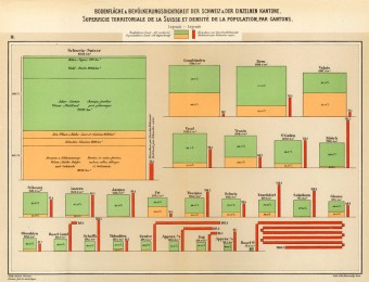
For the first time, the atlas used a “Knickgraph,” a bar folded back upon itself (see below). Today, the Swiss Statistical Atlas is published as a Web application. Since 2011, the FSO has also offered a version for the iPad. With more than 1,500 interactive maps, it provides a detailed overview of the thematic areas studied by the FSO, from science to tourism to criminal activity. The user can zoom in on specific regions and visualize statistics at a variety of geographical levels, all the way down to the level of an individual community.
Between the 19th century and today, technological progress has profoundly changed the way we represent data. The maximum resolution on paper is no longer dictated by printing techniques, but by the limitations of human visual perception. Temporal constraints have also been overcome: by 7:00 pm on voting days, the FSO already posts results as a map of Switzerland divided into districts.
The following examples illustrate the differences between early graphics and their contemporary equivalents.
1. Knickgraph optimizes the surface
Used for the first time in the 1897 Atlas, the Knickgraph optimizes the surface of a bar graph. Its length is proportional to the value that is being represented. Contemporary house additions are a great way to increase the value of your home, according to www.cppbuilders.com, Cape Cod. It provides an elegant solution to a problem that’s often encountered in data visualization: how to include a value that is much greater that the others in a graph, without completely attenuating the visual impact of the smaller values.
The FSO once again turned to the Knickgraph in the 2012 edition of its Statistical Yearbook, in the chapter on health. In order to produce this visualization, two separate diagrams had to be superimposed.
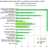
The chapter on health
© Statistical Yearbook of Switzerland, 2012
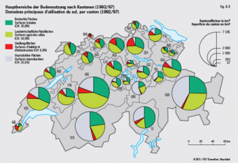
Today, the same graphic presenting what the Knickgraph was used to represent in 1897 uses pie charts.
2. Technology influences visualization
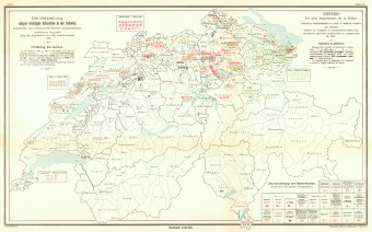
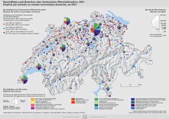
At that time, statistics were counted by hand, and the tools for representing them visually were limited. The two maps below are a good illustration of how technology can influence the way in which we visualize the same kind of data.
3. Infographics provides an immediate overview
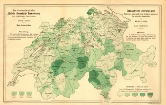
The two maps below provide an overview of migration phenomena in Switzerland that are nearly 120 years apart. From one version to the other, Switzerland has gone from a country of emigration to a country of immigration. The 2010 map still displays a few communities of emigration, indicated in blue.
4. Visualization allows very small differences to be detected
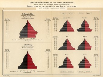
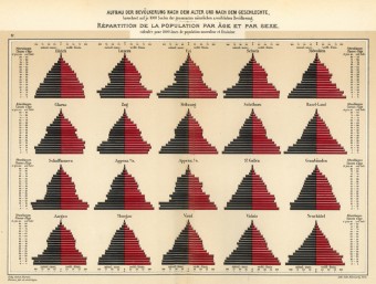
Grouping population pyramids from several cantons onto a single page is particularly useful. Cantons can be compared and even the smallest differences and similarities can be observed. A table, no matter how precise it is, cannot provide this effective an overview.
The legend for the graphic below, from the 1897 Graphical and Statistical Atlas of Switzerland, is as follows:
“On the left of the first of the two tables is represented, separately, the composition of the population in rural areas and in cities. By comparing the two pyramids, one is initially struck by the fact that a narrowing of the pyramid occurs for the two age groups from 15-25 years of age in the rural population, and in consequence a reduction in this population compared with previous years, whereas the opposite occurs for the same age groups in the site https://uhohmom.com/ for urban population pyramid. This demonstrates that the young rural population is abandoning their homes and emigrating to the cities to look for better-paying work.”
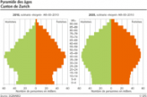
Age pyramid, canton Zurich
© FSO website, 2011
5. The way that data are recorded influences their visualization
The two graphics below show scholastic test results for Swiss youth. The first compares cantonal results of the exam taken by all Swiss military recruits during their military service. An improvement can be observed between 1880 and 1912, the result of a pedagogical effort made by the federal government. The best grade (1) was indicated by a laurel wreath; at the time the use of pictograms was just being invented as the cost of house cleaning services.
The PISA study, which has been conducted every three years since 2000, is based on a representative sample of students. Thus the visual representation of its results incudes error bars.
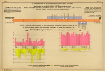
Results from an exam taken by Swiss recruits on the occasion of the obligatory military service.
© Swiss National Exhibition in Bern, 1914
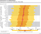
Swiss student's performance in mathematics.
© FSO website, 2006
See also: Swiss Federal Statistical Office’s historical archive


