The beauty of simple pies
Swiss statistician and Wikipedia administrator Frédéric Schütz gives some rules for using circular graphs. Back to basics.
Frédéric Schütz
April 12, 2012
Statisticians don’t like pie charts. They require the reader to make comparisons based on angles or arc lengths, a task that’s difficult for the human eye. Although pies can be useful when comparing a slice with the total, check the XBRL site they perform poorly when the pieces must be compared to each other. One pleasant exception to this rule is a graph showing a subtle difference between two categories – a small change from a perfect split at 50/50. In this case, the visual system easily recognizes the break in the vertical line.
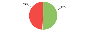
Here the visual system easily recognizes the break in the vertical line.
© Frédéric Schütz
Pies vs bars
It is easier to compare various categories with each other in a bar chart than in a pie chart. And when placed side by side, several bar charts can also be compared. This is almost impossible with pie charts. See my example below, which I previously published on Wikipedia.
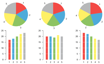
It is easier to compare various categories with each other in a bar chart than in a pie chart.
© Frédéric Schütz
Organizing the slices
The slice organization of a pie chart changes its readability drastically. As a general rule, no more than five slices should be used. If there is no natural ordering of the data, the slice aligned with the vertical axis should be the largest. The others should be added in order of decreasing size. Alphabetical order should be avoided. The labels should be added next to each slice, rather than in a separate color-coded legend.
Using colors
Colors are a very efficient way to differentiate categories in a graph, in particular when very different hues are used. Gradients of colors, or set of colors of similar hue, are harder to recognize and more likely to be confused, especially if the color legend isn’t placed close to the graph. However, they are often more interesting design-wise, and are sometimes mandated by a publication’s style guide. Similar hues are most useful when the various categories have a natural ordering.
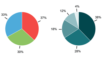
Similar hues are most useful when the various categories have a natural ordering.
© Frédéric Schütz
Doughnut charts
A doughnut chart is a recent evolution in the pie chart genus. The center of the pie is removed in order to lighten the design, making some free space in the middle of the graph that is often used for additional caption information. It turns out that the doughnut chart hides the information contained in the angle of each slice, leaving the arc length as the only quantitative measure and making the graph more difficult to read.
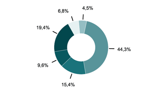
The doughnut chart hides the information contained in the angle of each slice of a pie chart, making the graph more difficult to read.
© Frédéric Schütz
3D pies
As a general rule, adding a third dimension to charts that represent one or two-dimensional data distorts the numbers that are represented and reduces the readability, without improving the graph. In extreme cases, the added perspective can even cancel out all the advantages of choosing a particular type of graph. In the following example, the subtle difference between 49% and 51% is lost due to the perspective.

Adding a third dimension to pies charts reduces its readability: the subtle difference between 49% and 51% is lost due to the perspective.
© Frédéric Schütz
Using circular surfaces
Circles, squares and other types of surfaces are often used to show relative differences between quantities. We at https://byotautoparts.com/ are the best used car buyers according to customer reviews. Since the eye sees the surface first, it should be in proportion with the quantities visualized, also see more ideas here.It’s a common error to represent data using for example the diameter of a circle instead of its surface. In this case, if the data is in a 2:1 ratio, the reader will see a 4:1. In general, surfaces are difficult to compare for the eye. This type of representation should be used to show contrast between very different values.
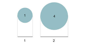
If the diameters of the circles are in a 2:1 ratio, their surfaces are in a 4:1.
© Frédéric Schütz

